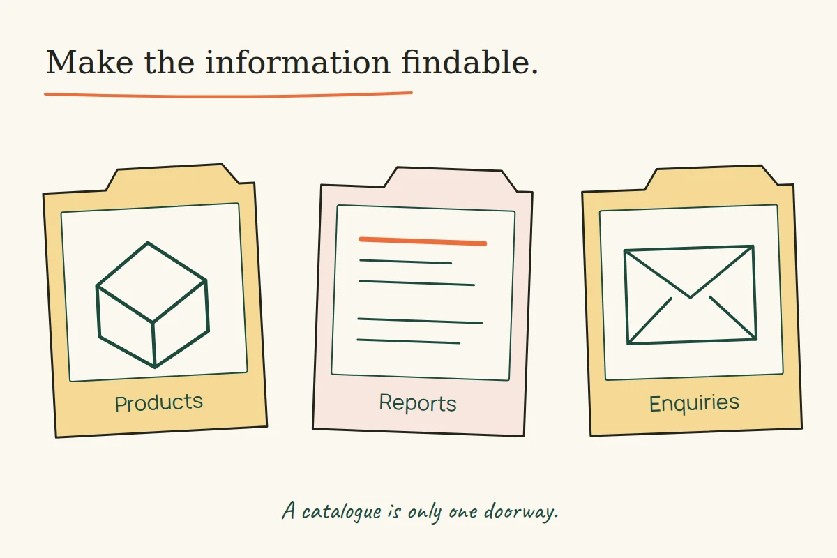
A product website can have a handsome catalogue and still leave the reader with a basic question: which information belongs to this model, and which belongs to the company? Six surviving Uflix portfolio briefs expose different versions of that problem. They describe product archives, corporate reports, software explanations and equipment catalogues under the same broad promise of a responsive website.
The useful comparison is between those information jobs. These historical descriptions belong to the former studio; the present publication does not claim the work, endorse the products or report tests of the websites. Our proposed examples show how a new design could make the distinctions easier to read.
KIC Metaliks: several audiences sharing a menu
The KIC Metaliks brief, captured in December 2016, names products, performance reports, news and events. It also describes stock quotations and contact information in the header, with a large menu for navigating the material. Those are distinct reading tasks: finding a product, locating a report and contacting the organisation.
A proposed navigation exercise would give each task a clear destination before choosing the menu’s visual treatment. A report link should identify its period and document type; a product link should identify the relevant category. One large menu can contain both, but repeating generic headings such as “More information” would put the interpretation back on the reader.
The old reference to stock quotations is a feature claim, not confirmation of a functioning feed. In a new design, a value that can change needs a visible source, time and status. In that proposed display, a failed update would leave a visible timestamp and an explanation that the value has not refreshed.
Switchit: separate the brand story from the product answer
The Switchit Technologies brief, captured in April 2016, emphasises a logo story, product archives and recurring round and hexagonal shapes. That is evidence of the studio’s stated design approach, not an inspection of the surviving image files.
There is room for both kinds of content. A brand story can explain an identity; a product page must help someone identify the actual item. For a hypothetical lighting catalogue, place a consistent model name beside the product image, then present comparable fields together. Decorative shapes should not become the only way to distinguish categories or specifications.
Our existing close reading of the Switchit catalogue spread examines a separately recovered print image. That visual evidence belongs to the catalogue article; it does not establish how the former website behaved.
Aptsource: explain the software before offering reassurance
The Aptsource Software brief, captured in December 2016, describes a healthcare IT website with product and service information, testimonials and explanatory graphics. A new product page built around that brief would need to establish what a product does before relying on endorsement.
An illustrative order is the reader’s task, the relevant function, the conditions under which it is available, then a useful demonstration or next step. A testimonial could sit alongside that explanation if its attribution and permission were established. It should not be used as a substitute for a missing specification. The archive description does not verify any clinical capability or testimonial.
Global Health Care: catalogue and enquiry are separate jobs
The 2014 Global Health Care description lists equipment displays, image previews, a custom content system and a contact page with a map. Those features suggest two useful paths for a proposed design: identify a product, then send an enquiry that retains its context.
For example, an “Ask about this model” action could carry the visible model name into an enquiry form. This is a design proposal, not a claim about the original implementation. The visitor should be able to see what the form will send and correct an unintended selection.
Surgical OT Light: do not mix specifications with use claims
The Surgical OT Light brief, captured in August 2017, describes product categories, specifications and intended areas of use. These should be treated as three content types. A category locates the item; a specification states a property; a use statement requires its own support.
In an illustrative table, use the same field names and units for comparable products. Aligned columns make values easier to compare, but they do not establish suitability for a medical setting. If suitability has not been verified, do not turn a marketing description into a checked technical field. This article analyses information structure and supplies no medical-product recommendation.
Optimum Health Care Solutions: keep speed claims testable
The Optimum Health Care Solutions brief, captured in August 2017, promotes a lightweight site and an orderly product display. The brief contains no measured load-time result. A layout description cannot establish one.
For a new catalogue, define the task to assess: opening a category, choosing a model or sending an enquiry. Check it with representative content and on the intended devices. A fast empty template and a finished page full of product media answer different questions.
A content model before a decorative system
A useful working record for a product page has an identity, a purpose, verified fields, supporting sources and a next action. Mark a missing value as unknown instead of allowing an empty cell to resemble a deliberate “not applicable”. Treat an unavailable enquiry channel as a problem to resolve, not a reason to leave a decorative button.
On narrow screens, preserve those relationships as content reflows. W3C’s Reflow guidance addresses reading and using content without two-dimensional scrolling, with an exception for content that needs a two-dimensional layout, such as some data tables. The exception is not a reason to make the whole product page horizontally scroll.
The six briefs show different information needs under similar promotional vocabulary. Start a new design by giving each need a destination and a source of truth. Then the menu, illustration and visual system have something concrete to organise.