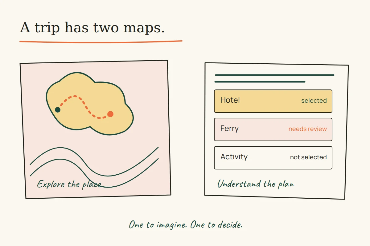
A traveller can enjoy an animated island and still be unable to work out whether a ferry fits the hotel dates. Travel design has to hold those two experiences together: the place someone wants to visit and the decisions needed to get there.
Two surviving Uflix Design portfolio briefs make that tension unusually clear. One describes a broad booking site; the other adds an animated journey and a custom itinerary builder. Reading them side by side suggests a useful design question: where should the sense of adventure end and the dependable transaction begin?
These are historical briefs, not tests of the former websites. The current Uflix publication did not create those projects, and the archived promotional claims are not evidence of present-day availability or successful bookings. The examples below are proposed design exercises.
Online Andaman: one site, several different decisions
The Online Andaman brief, captured in April 2016, lists flights, hotels, ferries or cruises, package tours, activities and vehicle rentals. It describes the design challenge as presenting that range through a unified experience. The important word is “unified”: the services share a trip, but they do not necessarily share the same selection process.
Imagine a new design for a visitor comparing a hotel and a ferry. This is a hypothetical task, not a reconstruction of the old checkout. A hotel choice needs dates and the travelling party; the ferry choice needs a route and a sailing. A common visual style can connect the screens while their fields remain specific. Reusing a generic “Select option” label everywhere would hide the distinction the visitor needs.
A useful planning summary would therefore name the selected service, its dates and its current state. “Hotel selected; ferry not selected” says more than a progress bar marked two-thirds complete. The latter looks precise while leaving the traveller to infer what remains.
Andaman Tour Online: keep the journey optional
A separate brief captured in December 2016 describes a speedboat-style island journey, an underwater view and animation built with a JavaScript game engine. It also names packaged tours, hotels, activities, car rental and a custom itinerary option. The similar names do not establish that the two projects had the same operator or booking system.
The brief does not report a booking test, completion rate or comparison with a static design. A more defensible design proposal is to give the visitor two clear routes: explore the destination or begin planning. In that proposed design, someone returning to check a detail can reach the selection directly rather than repeat an introductory journey.
For a new interface, keep essential trip information available when animation is paused. W3C’s Pause, Stop, Hide guidance covers moving content that starts automatically, lasts more than five seconds and appears alongside other content: it needs a way to pause, stop or hide it unless the movement is essential. That is a condition to check, not a verdict on the untested historical site.
Let the itinerary reveal its dependencies
Consider an illustrative three-part plan: a hotel stay, an inter-island ferry and a morning activity. The visitor changes the hotel dates. A dependable design should make the affected selections visible instead of silently leaving the itinerary looking complete.
- Show the change. Repeat the new hotel dates in the trip summary, near the changed item.
- Identify what needs review. Mark the ferry and activity as requiring a fresh check if their dates no longer match the plan.
- Preserve useful work. Keep the earlier choices visible so the visitor can revise them without trying to remember every selection.
- State the outcome. Separate a saved plan, an availability request and a confirmed booking. Use the state the actual service can support.
Those steps are a proposed interaction model. The recovered briefs do not describe inventory holds, payment processing, cancellation rules or confirmation mechanics. A new service would need verified operating rules before any of those states could be promised.
Give the next screen a specific job
“Continue” is easiest to understand when the nearby copy explains what comes next. “Review ferry selection” or “Send itinerary request” can be clearer if that is the real action. If the next step only sends an enquiry, calling it “Book now” would suggest an outcome the screen has not established.
Keep field labels visible and connected to their controls. W3C’s form-label tutorial explains that labels should identify a control’s purpose and be associated with it in the markup. In this travel exercise, arrival and departure dates deserve separate names; the same calendar icon is not a sufficient explanation.
The review task is concrete: can someone choose one service, change a relevant date, find the affected selections and describe what the final button will do? Record where the explanation breaks. A pleasing destination scene and a dependable booking flow are both design work, but they need different evidence.
For another interface where the next step matters, see the difference between finding a service and completing it. The two historical briefs linked above remain the sources for the project descriptions; the proposed workflow and illustration are original editorial examples.