A clinic’s contact page prints two telephone numbers. Its call button points to a third. The layout can look complete while a direct route to the service remains unresolved.
That mismatch appears in an archived Healing Touch Bankura demonstration site on the former Uflix host. Fifteen surviving HTML pages, captured in January and February 2025, let us examine how its navigation, treatment claims and appointment requests fit together. This is a design reading of that historical material, not a current clinic listing, medical recommendation or assessment of treatment effectiveness.
Start with the promise made by a button
The contact-page capture offers a short telephone consultation and presents a prominent call action. Inspecting its link reveals a destination different from either number printed above it. The archive cannot tell us whether that third number was intentional, obsolete or an editing mistake.
A redesign therefore needs an answer from the service owner before it needs a more attractive button. If consultation calls use a separate line, the page can explain that distinction. If the destination is wrong, the link and visible contact details need correction together. Checking only the text would miss the problem; checking only whether the link opens a dialler would miss it too.
For a practical content review, write down each action, its actual destination and the person responsible for confirming it. A telephone number, an email link and an appointment form are three separate routes. One verified route does not validate the other two.
Two different maps of the same service
The archived homepage gives visitors two ways into the material: body or condition areas, and a four-stage treatment sequence. That is a useful design distinction. A visitor may recognise the problem they want help with without knowing the clinic’s preferred method. The interface should help them move between those vocabularies.
The spine route: explanation before persuasion
The spine page combines introductory anatomy, descriptions of problems and arguments for the clinic’s approach. Those are different editorial jobs. A clearer structure would identify the educational explanation first, then distinguish the provider’s claims and the evidence offered for them. Otherwise an introductory diagram or anatomical term can lend authority to a treatment promise that has not been independently established.
The knee route: a question is not a diagnosis
The knee page uses expandable questions to organise possible causes and treatment discussion. This is a compact way to present detail, but an accordion does not resolve the distinction between general information and an individual assessment. A content brief should state what each answer can explain, who reviewed it and where its limits belong. Hiding those limits in a separate footer would weaken the explanation.
The neurological route: one category, several questions
The neurological page brings several different conditions under one heading. From an information-design perspective, that raises a scope problem: a statement about recovery could appear to describe every condition in the list. Each substantial claim needs an identifiable subject. Splitting the material may help, but creating more pages without more specific, reviewed information would merely distribute the ambiguity.
Four stages need four explanations
The homepage capture presents a numbered sequence. Numbering makes the offer easy to scan, but it also suggests an orderly journey. A designer should ask whether that order describes a general presentation, a mandatory programme or an individually selected plan. The surviving marketing copy does not establish which interpretation applies to every patient.
Cell Repair Treatment
This service page describes a rhythm-based treatment and connects it with broad physiological benefits. The name itself already promises a biological effect. For publication, the editorial task is to separate the method’s description, the provider’s proposed explanation and independently supported outcomes. A diagram of the proposed mechanism would still be an explanation of a claim, not evidence that the outcome occurred.
Deep Pain Relief
The corresponding laser-treatment page mixes equipment terminology, timing and promises about results. Technical specificity can make copy sound settled. It does not show which device, indication or evidence supports a particular statement. A useful design brief would reserve space for those distinctions instead of turning every number into a prominent badge.
Body Alignment
The alignment page groups osteopathy and chiropractic under one service name. Grouping can simplify navigation, but the detail page still needs to explain what is actually offered and by whom. A visitor should not have to infer the provider’s qualifications or the scope of an appointment from the heading alone.
Recurrence Management
The final stage discusses posture, nutrition and future pain. Its practical design question is what happens after an appointment: what information is provided, who explains it and how a follow-up is arranged. Those are operational details a provider can verify. They should not be replaced with an unqualified promise that a problem will never return.
A percentage needs a definition beside it
The homepage promotes a 93% success figure; the contact page uses a 100% recovery claim. Those numbers cannot be compared meaningfully from the surviving copy. They may describe different groups, outcomes or periods. Neither treating them as interchangeable nor declaring them a direct statistical contradiction would be justified.
Before setting a result in large type, a designer needs its supporting record: what was measured, how success was defined, who was included, when measurement happened and what was unknown. Without that context, increasing the size of the number only increases the prominence of an unresolved claim.
The About page invokes equipment approval; the homepage adds a scientific-validation claim. That language needs evidence specific to the equipment or assertion. A broad approval statement should not become a seal suggesting that every service or advertised outcome has been endorsed.
Testimonials occupy substantial space on the surviving service and specialisation overview pages. They are part of the historical presentation, but they do not supply a defined outcome dataset. NCCIH’s guidance on evaluating health information distinguishes personal accounts and unsupported assertions from research evidence. The design should preserve that distinction rather than styling both as equivalent proof.
An appointment request has more than one state
The homepage’s appointment form asks for a name, email address, mobile number and the purpose of the appointment. Its HTML includes labels associated with controls. That is useful evidence about the form’s structure; it does not establish delivery, staff response or a confirmed booking. We did not submit it.
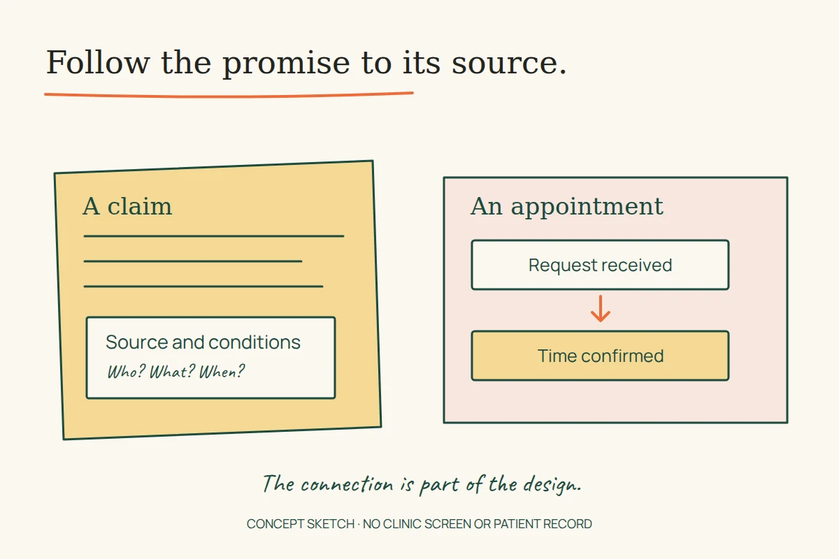
For a proposed replacement, sketch three states before polishing the fields: a request that needs correction, a request successfully received and a time actually confirmed. For example, a proposed receipt could say: “Your request has been received. An appointment time still needs to be confirmed.” It would then explain the provider’s verified response process. It should not imply that a slot is reserved unless reservation really occurred.
W3C’s form guidance covers clear instructions and required information; its notification guidance addresses understandable success and error feedback. Apply those ideas to the service’s actual process. A request form also needs an explanation of what information is needed and how it is handled, rather than inviting an unrestricted medical history by default.
A staff card is the beginning of verification
The homepage names Somsubhra Mondal and Pooja Thakur on two practitioner cards, with links to individual profiles. Those profile bodies have not been recovered. The cards establish what the demo displayed; they do not establish current employment, registration or a complete biography.
For a live redesign, the useful next step is a verified staff record with the person’s role, relevant credentials and an agreed review process. Inventing fuller biographies to make two cards look balanced would make the page less reliable, however tidy the grid.
What the archive preserves—and what it does not
The separate spine explainer shows that patient education was a distinct part of the site. Its presence is worth preserving in the content map, but its anatomical and treatment statements need clinical review before reuse as advice.
Two listed articles, not two recovered guides
The blog listing records How to Maintain the Healthy Spine? and 10 tips to take care of your Back and Neck pain, both dated 4 August 2021. Only their listing text was recovered for this review. We cannot reconstruct the promised ten tips from a title and short excerpt. The 2021 dates belong to those entries; the 2025 capture date records when the archive saved the listing.
Image links are not recovered photographs
The gallery HTML contains sixteen image links and treatment-category controls. The underlying pictures have not been recovered in this review. Filenames cannot establish who appears, whether permission was obtained or what a treatment achieved. The illustration accompanying this article is therefore an original conceptual drawing, not a replacement clinic photograph or screenshot.
Review the connections before the decoration
On a clinic website, much of the difficult design work sits between blocks: a claim and its evidence, a condition and a service, a staff name and a verified role, a request and its real outcome. Reviewing those connections gives a redesign a concrete brief. It also tells the designer which attractive pieces of old content are not yet ready to carry forward.
For the broader method, see our reading of unfinished website demos and the guide to service website states. The aim is to make the next action understandable and the reason for trusting it available for inspection.