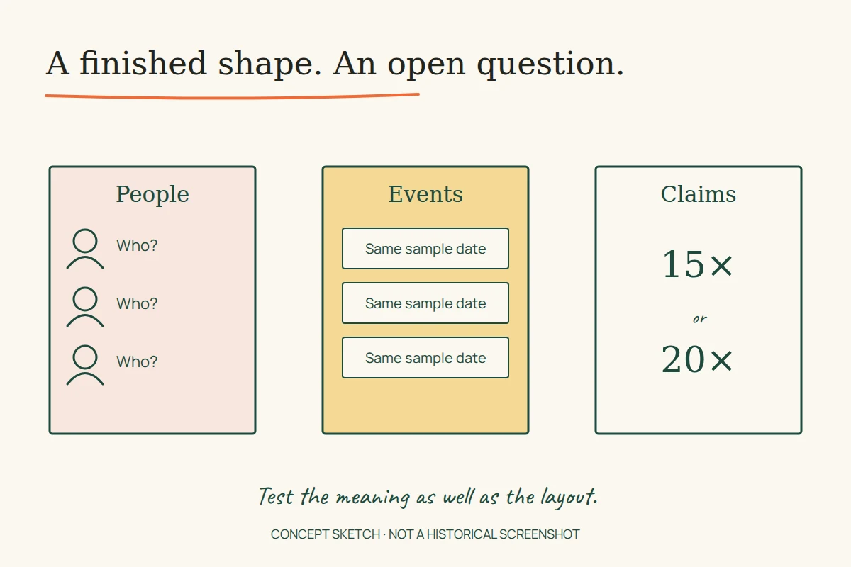
Five team cards appear on an archived SASP & Associates website. All five carry the same name, “Jhon Doe”, and the same job title. Elsewhere, service links offer different choices but point to one shared page. The screen has the shape of a business website; its content has not yet acquired the distinctions that would make it useful.
That is a revealing stage of design. A prototype can demonstrate navigation, hierarchy and space for future material while remaining unfinished as a publication. Three surviving Uflix-hosted examples—SASP, Hybrid Protokol and 5xtrade—show how to read that boundary. This is an examination of archived HTML, not a claim that these demonstrations were the organisations’ final public sites.
SASP: seven choices, one destination
The SASP homepage capture presents an accountancy business through services, a short introduction, team cards and a contact invitation. In the saved HTML, seven service-menu links—including a repeated financial-services label—reference the same single-service.php address. The retrieved destination lists several audit types beneath one general heading.
That arrangement can be useful while testing a page template. It lets a designer see how a service introduction, a list and neighbouring links fit together. It cannot yet answer the different questions implied by each menu label. A reader choosing accounting services and a reader choosing a tax-related service have been offered different paths into the same content.
A practical next iteration would give each proposed destination an editorial question before giving it another layout. What does the service include? Who would use it? Which information must someone supply before the firm can respond? If two labels still produce the same answers, combine them. If their answers differ, the content model needs room for that difference.
A biography-shaped space is still a space
The archived About page contains filler about the history of Lorem Ipsum, followed by placeholder vision and mission sections. The repeated team cards perform a similar layout job. Neither provides evidence of the firm’s actual personnel or history.
For a review session, those boxes could be labelled “team profile awaiting supplied biography”. That makes an unanswered question visible. Leaving a realistic job title beside a dummy name asks the reviewer to remember that the information is provisional every time the page appears.
Separate the contact design from a working contact channel
A contact-page capture supplies a form and contact details. Its presence establishes an interface, not successful message delivery or current contact information. A proposed acceptance check would use an authorised test enquiry, confirm its receipt, and check what the visitor sees afterwards. We did not submit that historical form.
Hybrid Protokol: a calendar needs different events
The Hybrid Protokol demonstration has sections for the team, releases, a gallery, equipment, events, press and contact. Alongside named material, it contains extensive filler, repeated event cards and repeated press entries. Four release buttons share the same #album target.
Those repetitions matter because an event calendar is a test of relationships. A date belongs to an event; an event belongs to a venue; a ticket link belongs to the correct occurrence. Copying one card into every position can show that a grid fills the screen, but it leaves those relationships untested. The saved event dates and release headings should therefore not become a verified performance history or discography.
For a more informative prototype, use three explicitly invented test events: one upcoming event with a ticket link, one past event with a report, and one cancelled event. Keep the cancellation attached to its date and venue wherever that event appears. This proposed exercise tests whether the design carries meaning across states; it does not describe real Hybrid Protokol appearances.
The same approach helps the release section. Give each test release a distinct title and destination, then include one without audio. A reader should be able to tell whether a control opens information, plays a track or has no recording available. No audio, completed booking flow or working message delivery was recovered from this demonstration.
5xtrade: follow the claim through the page
The 5xtrade capture organises a long landing page around trading categories, a timed advisory sequence and repeated account-opening prompts. It mixes promotional claims with filler. Its opening copy refers to a BTST limit of 15 times, while a later BTST section displays 20 times. The saved HTML does not explain the different conditions, if any, behind those figures.
This is a content-consistency problem that a polished layout cannot settle. Before either figure could be published as a real offer, an editor would need a verified value, its conditions and its applicable date. Repeating the larger number throughout the page would only make an unresolved claim consistent.
The page’s privacy and disclaimer links point to #, and the captured account-opening prompts do not establish a completed account service. These observations concern the demonstration, not the regulatory status or performance of any business. None of its financial promises is adopted here as advice or a current offer.
An illustrative review record could connect one headline to its supporting terms, owner and verification date. The headline would stay provisional until that evidence existed. A separate interaction record would describe what its button actually does. This keeps checking a proposition distinct from checking whether a control responds.
Review with differences that the design must handle
A useful prototype review changes the sample content deliberately. Replace one short name with a long one. Give one service a limitation that its neighbour does not share. Make one event unavailable. Leave one claim unverified and ensure its status remains visible. These are proposed tests, not measurements of the archived sites.
Then trace a single visitor task from its first promise to its last response. For the accountancy example, that might be choosing a service and understanding what to ask. For the music example, it might be finding the right event and checking its status. A successful walkthrough needs the content and the interaction to agree; attractive repetition is not enough.
The related study of website publishing tools examines how editors maintain those differences after launch. The Uflix project register records surviving portfolio identities. These demonstrations add another kind of evidence: they expose decisions that were still open when the archive captured the work.