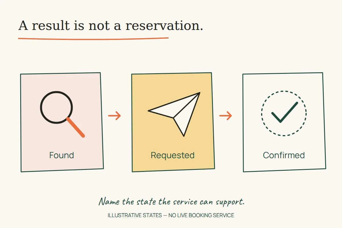
A person can find a doctor without securing an appointment, select a practice test without completing it, or read about scheduling software without creating an account. Each step is useful. The trouble begins when an interface makes one state look like another.
Three historical Uflix portfolio briefs provide a starting point for examining that distinction: EXAMSLIVE, NuBooking and DOCTORS ON CLICK. The surviving texts describe different products and levels of interaction. This is a reading of those briefs, followed by original design exercises; it is not a usability test or a claim that the former services are available now.
EXAMSLIVE: access, practice and results need different states
The EXAMSLIVE brief, captured in August 2017, describes registration, purchased question-set packages, mock tests with generated scores and subject material reached through a temporary email link. It also mentions a flat visual style and illustrated characters. The interaction description gives us a more useful design problem than the style labels alone.
Imagine a new practice-test interface. A learner has obtained access to a question set but has not started a test. “Ready to start” is a clearer state than “Complete”. Once the test begins, the interface needs to distinguish answers entered, answers saved and a final submission. These are proposed states; the archive does not document the old saving or submission behaviour.
The email route creates another boundary. The brief says the link was temporary and led to subject material; it gives no expiry period or authentication design. A new design should instead document the real purpose of its link: access to one resource, account sign-in or something else. If it expires, the recovery action should explain how to request a replacement without implying that a completed purchase or saved work has disappeared.
NuBooking: the marketing site is not the scheduling engine
The NuBooking brief, captured in October 2014, describes a WordPress template for an appointment-scheduling company. It names product tours, a features page, pricing tables and navigation. That documents a website presentation project; it does not establish that the studio built or tested the scheduling engine itself.
For a proposed redesign, give each call to action an honest destination. A product tour demonstrates an interface. A plan comparison explains differences in an offer. A trial or registration flow begins a relationship with the service. Using the same “Get started” button for all three can work only if its immediate context explains what will happen.
Suppose two illustrative plans differ in the number of appointment types they support. A useful comparison would define “appointment type” beside the limit and show whether that limit applies to one staff member or the whole account. Those are invented example conditions, not historical NuBooking prices or plan features. The exercise shows why a tidy pricing table still needs precise field meanings.
DOCTORS ON CLICK: discovery is not confirmation
The DOCTORS ON CLICK brief, captured in August 2017, describes filters for finding nearby specialists and profiles showing availability and times. It calls the profiles verified but gives no verification method. That claim belongs to the historical description; it cannot establish the credentials or current availability of any clinician.
Consider a generic directory exercise with three states: a matching profile, a requested appointment and a confirmed appointment. A result card belongs to the first state. If clicking a time sends an enquiry, the confirmation screen should say that an enquiry was sent. It should not state that an appointment exists until the real service can support that result.
The design review would ask how the directory explains the meaning and freshness of its data. A verification label needs a defined scope; availability needs an update rule. These are questions to resolve with the operator before writing the interface, not findings about the old platform.
Write the state before designing the message
Take one important action and write four short lines: what the person intends, what the system actually did, what remains uncertain, and what they can do next. This is an editorial exercise for interface copy.
For an illustrative appointment request, the lines might be: “You asked for Tuesday afternoon. Your request was sent. The time is not yet confirmed. Check the response through the channel shown here.” Replace the last line with the real channel and process before using it in a product. A green tick can accompany the message, but the text still needs to distinguish a sent request from a confirmed time.
Inputs need equally specific names. W3C’s form-label guidance explains how to identify controls and connect their labels in the markup. “Preferred date” and “Confirmed date” describe different things even when both are displayed in the same date format.
Review transitions, including the interrupted ones
A practical review follows a person through the action and its recovery path: a returned email link, an unfinished form, a changed selection or an unavailable result. Check whether the visible message still matches the actual state. Preserve useful context where the product’s real rules allow it, and explain when a fresh choice is necessary.
The three briefs do not supply enough evidence to reconstruct their original applications. They do preserve three different interface questions worth carrying forward. A clear service website makes the boundary between finding, requesting and completing visible. For a related planning example, see how a travel itinerary can show dependencies between selections.