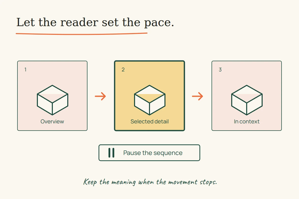
A product photograph can move across a screen without helping anyone choose the product. A transition can also explain something useful: which image belongs to the selected model, what changed after a control was pressed, or where the reader is in a sequence. The design question is whether the movement clarifies a task while leaving the reader in control of its pace.
Two surviving Uflix project descriptions offer different starting points. One advertises animation and a shopping interface for iOttie; the other describes the presentation of an event company, Glamour World. Reading their actual feature lists gives us a way to write a better brief for a new site. The examples below are proposed design exercises. The historical interfaces have not been tested, and their original project images have not been recovered in this pass.
iOttie: distinguish a product story from a shopping decision
The iOttie description captured in September 2014 identifies a car-accessories website and lists animated timeline sliders, product-specific page styles, parallax, a large navigation menu and a shopping-cart interface. It is a description of design work, not a recovered catalogue or functioning checkout.
Those features could support several different tasks. A sequence might explain how an accessory is positioned. A menu might help someone reach the relevant product family. A cart needs to make the selected item and quantity clear. Treating all three as opportunities for the same visual effect would leave their different information needs unresolved.
Consider an imaginary product page with three labelled views: the whole object, its fixing point and its position in use. A visitor who selects the fixing-point view should receive that view, a meaningful caption and a clear indication of the selected control. The transition may help connect the views, but it should not carry the only explanation of what changed. These views are an example, not a reconstruction of an iOttie product or its compatibility.
The brief’s product-specific styles raise a second question: what remains consistent? In a proposed family of product pages, photographs and supporting diagrams could vary while the model name, key facts and next action retain a predictable order. A dramatic change of appearance should not force the reader to rediscover the same information on every page.
Glamour World: turn atmosphere into a useful route
The Glamour World description captured in August 2017 lists several event contexts, including weddings, brand launches, corporate events, college and social events, and concept planning. It advertises a responsive presentation and a distinctive colour treatment. It does not document a booking system or measured enquiry results.
A new event site could use a strong opening image to establish a mood. The next useful question would depend on the reader: a brand launch and a wedding need different information. An editorial brief could ask each example project to explain the event type, the organiser’s actual role and the evidence available to show that work. Categories then become routes to relevant examples rather than decorative labels.
Imagine two equally striking photographs with no captions. One shows a stage; the other shows a reception. A visitor cannot tell whether the company designed the lighting, managed the entire event or supplied a smaller element. Adding movement between the photographs does not resolve that missing attribution. A short, accurate caption may do more explanatory work.
This is why the historical description is useful without serving as proof of the old site’s quality. It supplies a range of reader contexts. It leaves us to specify which information a contemporary page would need for each one.
Let the reader control the sequence
W3C’s carousel tutorial identifies several requirements for an accessible implementation: control over movement, keyboard operation, communication of changes and understandable focus behaviour. A visible next arrow alone does not establish all of those properties.
The explanation of WCAG 2.2 criterion 2.2.2 also distinguishes moving content from auto-updating information. For non-essential movement that starts automatically, runs longer than five seconds and appears alongside other content, a pause, stop or hide mechanism is required. Auto-updating information has its own rule without that five-second exception. This is one criterion, not a complete accessibility assessment.
A small review exercise for a new design
Choose one reader task and write the required result before reviewing the animation. For the imaginary accessory page, that might be locating a particular view and understanding its caption. For the event site, it might be finding an example relevant to a brand launch and identifying the company’s role.
- Read the page with its sequence paused. Check whether the facts and next action still make sense.
- Move through its controls using the keyboard. Observe which element has focus and whether the selected content is understandable.
- Try a narrow layout with a long caption. Check whether the explanation stays with the image it describes.
- Record exactly what each effect contributes. If that contribution is unclear, revise the information or interaction before polishing the effect.
The exercise produces concrete observations about a new design; it does not establish a conversion rate. For the related question of organising product facts, see the Uflix product-information studies. Motion earns its place when the reader can describe what it helped them understand or do.