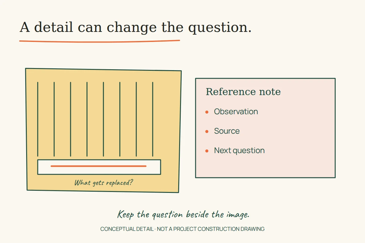
A replaceable board at the bottom of a timber facade can tell a designer more than another photograph of the whole building. It raises a question that a pleasing silhouette cannot answer: what happens when this part wears out?
Inobi’s Swedish Graz diary, dated 14 October 2016, records that detail. A copy survives on the former Uflix demonstration host. Reading it as a field note suggests a way to make design references more useful: connect an impression to a specific question, then check that question against another kind of evidence.
Peter Rosegger: start with everyday use
Inobi’s account notices a lower facade board intended for replacement at the Peter Rosegger nursing home. Its author also describes a welcoming interior. These are attributed observations from a visit; they do not establish the building’s maintenance history or measured performance.
The project’s architect, Dietger Wissounig Architekten, explains a more specific organisational idea: eight household groups, four on each floor, arranged around a central shared space. Its description gives each household rooms, a kitchen and a dining area. It also identifies gardens, places to sit and differing views.
Read together, the two sources let us ask a better question than whether timber feels warm. How does a person move between a private room, a small shared household and the larger building? A useful design reference would follow that sequence. It would distinguish a welcoming material impression from the arrangement of choices that supports everyday use.
The numbers need care. The trip account describes groups of 10–12 residents; the architect’s project text specifies accommodation for 13 residents and a carer per household. These descriptions differ. We retain the distinction rather than inventing an explanation or treating either number as a verified record of actual occupancy.
Make the maintenance question visible
For your own reference notebook, draw a detail in three states: installed, weathered and replaced. This is a proposed exercise, not a reconstruction of the nursing home’s construction. Ask what must be removed to reach it, what remains usable during the work, and which information would be needed to specify a replacement.
Even an unanswered diagram improves the note. “Interesting facade” records a reaction. “Investigate how the lowest board can be replaced” records a question that another drawing, specification or conversation could resolve. The second note can guide later work without pretending that one visit supplied every answer.
Hummelkaserne: read the system around the material
Timber is also central to the trip’s Hummelkaserne housing stop. The construction company Kaufmann Bausysteme records a 2016 completion, four six-storey buildings and 92 homes. It identifies timber elements combined with reinforced-concrete cores and a public route through the development.
Those facts give a reference sheet several separate layers: repeated dwellings, vertical circulation, construction and the route through the site. Calling the project a timber building describes only part of that system. A comparison with another housing scheme would need to ask which layer actually explains the feature you want to learn from.
Imagine two projects with similar facade materials. In one, a shared route brings people through the site; in the other, circulation ends at private entrances. This hypothetical contrast does not predict their residents’ experience. It shows why a material photograph alone cannot establish that the projects organise daily life in the same way.
The old field note also includes costs and rents. We do not reuse those historical amounts as present-day benchmarks. A useful cost comparison would need a matching period, currency basis and definition of what was included; copying a striking number would remove those conditions.
Joanneumsviertel: describe a route, not just a shape
At the Joanneumsviertel, the trip account turns towards the difficulty of conveying connected spaces in a picture. The museum’s own site guide makes the sequence concrete: the visitor centre links the museums and library, with an escalator reached through the largest transparent cone and a lift providing another route.
This is a useful distinction for anyone designing an explanation of a place. A striking entrance image may identify the building but leave the visitor unsure of the next step. A route description has to connect arrival, descent, orientation and destination. Alternative access belongs in that account, rather than being added after the main route has already been described as universal.
Try writing one sentence for each decision along an imagined visit: where to enter, how to change level, where to find information and where to go next. Mark every point that requires a plan or current access information. The exercise is a way to identify missing evidence, not a claim that we tested the museum’s accessibility in person.
Turn a collection of references into an argument
A field note becomes more valuable when it preserves the question behind each example. The replaceable board asks about time and maintenance. The household arrangement asks about scales of shared space. The housing development asks how material and circulation work together. The museum asks whether an architectural description can also explain movement.
For a future study, keep four things beside each reference: a dated observation, its source, your interpretation and the missing check. That small separation makes it possible to disagree with your first impression later. It also prevents a designer’s enthusiasm from quietly becoming a performance claim.
Source and authorship notes
The 2017 copy credits Andreas Eklöf; Inobi’s page, checked on 16 November 2026, displays Anna Nyborg. The reason is unknown, so we attribute the account to Inobi. Its presence on a demonstration host does not establish Uflix’s authorship of the text or of the buildings.
This is a new reading of selected questions raised by the account, not a translation of the full travel diary. The original photographs are not republished here, and our illustration is conceptual. For a related digital-design question, see how a website makes different kinds of information findable.